如何用纯css来判断鼠标进入元素的方向呢?
这是一个面试问题。
给定结构:
1
2
3
4
5
6
7
8
9
10
11
12
13
14
15
16
17
18
19
20
21
22
23
24
25
26
27
28
29
30
31
32
33
34
35
36
37
38
39
40
41
42
43
44
45
46
47
48
49
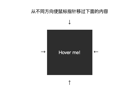
| <!DOCTYPE html>
<html lang="en">
<head>
<meta charset="UTF-8">
<meta name="viewport" content="width=device-width, initial-scale=1.0">
<title>Document</title>
<style>
body {
padding: 2em;
text-align: center;
}
.block {
position: relative;
display: inline-block;
width: 10em;
height: 10em;
vertical-align: middle;
}
.block_content {
position: absolute;
top: 0;
left: 0;
width: 100%;
height: 100%;
text-align: center;
line-height: 10em;
background: #333;
color: #FFF;
}
</style>
</head>
<body>
<p class="text">从不同方向使鼠标指针移过下面的内容</p>
<p>↓</p>
<span>→ </span>
<div class="block">
<div class="block_content">
Hover me!
</div>
</div>
<span> ←</span>
<p>↑</p>
</body>
</html>
|
效果:
思路:
我们在css中判断鼠标移入用的是:hover,关键是如何判断鼠标移入的方向。
我们用:hover只能知道鼠标移入了,而却无法得知鼠标移入方向的。
那么如何通过css来判断出鼠标移入的方向呢?
一开始我想用border来实现,可是一想border不能各自被hover。于是只能制造能被hover的块来实现。
实现:
1
2
3
4
5
6
7
8
9
| <div class="block">
<div class="block_hoverer">上</div>
<div class="block_hoverer">下</div>
<div class="block_hoverer">左</div>
<div class="block_hoverer">右</div>
<div class="block_content">
Hover me!
</div>
</div>
|
1
2
3
4
5
6
7
8
9
10
11
12
13
14
15
16
17
18
19
20
21
| .block_hoverer {
position: absolute;
width: 100%;
height: 100%;
z-index: 1;
}
.block_hoverer:nth-child(1) {
background: red;
}
.block_hoverer:nth-child(2) {
background: lime;
}
.block_hoverer:nth-child(3) {
background: orange;
}
.block_hoverer:nth-child(4) {
background: blue;
}
|
结果只有最后一块露了出来。
1
2
3
4
5
6
7
8
9
10
11
12
13
14
15
16
17
18
19
20
21
22
23
24
25
26
| .block_hoverer {
position: absolute;
z-index: 1;
width: 100%;
height: 100%;
transition: all 0.3s ease;
}
.block_hoverer:nth-child(1) {
background: red;
top: -90%;
}
.block_hoverer:nth-child(2) {
background: lime;
top: 90%;
}
.block_hoverer:nth-child(3) {
background: orange;
left: -90%;
}
.block_hoverer:nth-child(4) {
background: blue;
left: 90%;
}
|
1
2
3
4
5
6
7
8
| .block_hoverer {
transition: all 0.3s ease;
}
.block_hoverer:hover {
opacity: 1;
top: 0;
left: 0;
}
|
1
2
3
4
5
6
7
8
9
10
11
12
13
14
| .block {
position: relative;
display: inline-block;
overflow: hidden;
width: 10em;
height: 10em;
vertical-align: middle;
}
.block_hoverer {
opacity: 0;
}
.block_hoverer:hover {
opacity: 1;
}
|
1
2
3
4
5
6
7
8
9
10
11
12
13
14
15
16
17
18
19
20
21
22
23
24
25
26
27
28
29
30
31
32
33
34
35
36
37
38
39
40
41
42
43
44
45
46
47
48
49
50
51
52
53
54
55
56
57
58
59
60
61
62
63
64
65
66
67
68
69
70
71
72
73
74
75
76
77
78
79
80
81
82
83
84
85
86
87
88
89
90
| <!DOCTYPE html>
<html lang="en">
<head>
<meta charset="UTF-8">
<meta name="viewport" content="width=device-width, initial-scale=1.0">
<title>Document</title>
<style>
body {
padding: 2em;
text-align: center;
}
.block {
position: relative;
display: inline-block;
overflow: hidden;
width: 10em;
height: 10em;
vertical-align: middle;
transform: translateZ(0);
}
.block_hoverer {
position: absolute;
z-index: 1;
width: 100%;
height: 100%;
opacity: 0;
transition: all .3s ease;
}
.block_hoverer:nth-child(1) {
background: red;
top: -90%;
}
.block_hoverer:nth-child(2) {
background: lime;
top: 90%;
}
.block_hoverer:nth-child(3) {
background: orange;
left: -90%;
}
.block_hoverer:nth-child(4) {
background: blue;
left: 90%;
}
.block_hoverer:hover {
opacity: 1;
top: 0;
left: 0;
}
.block_content {
position: absolute;
top: 0;
left: 0;
width: 100%;
height: 100%;
text-align: center;
line-height: 10em;
background: #333;
color: #FFF;
}
</style>
</head>
<body>
<p class="text">从不同方向使鼠标指针移过下面的内容</p>
<p>↓</p>
<span>→ </span>
<div class="block">
<div class="block_hoverer">1</div>
<div class="block_hoverer">2</div>
<div class="block_hoverer">3</div>
<div class="block_hoverer">4</div>
<div class="block_content">
Hover me!
</div>
</div>
<span> ←</span>
<p>↑</p>
</body>
</html>
|
最终效果:
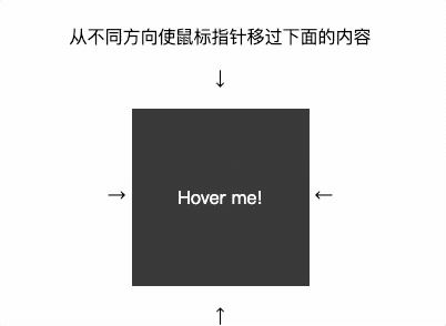
Gif由gifox制作而成